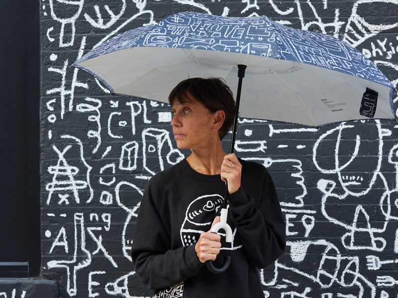
out·spo·ken  /ˌoutˈspōkən/
direct and open in speech or expression

Launched in April 2020, the inspirational hair-on-hide artistic rugs of Be OUTSPOKEN gained fast recognition—garnering five coveted home decor awards. This fall in High Point, the company will debut a special edition monochromatic series for its CHOOSE TO SHINE signature art design. Gold hues to warm light browns were created in custom pigments specifically for the colorway of the hide.

Described by Jaipur Living as being “steeped in both history and modern style, the Reconnext collection by Jenny Jones combines globally-inspired motifs with on-trend colorways and re-imagined patterns,” Reconnext does precisely as the portmanteau implies: it reconnects us with the past as we look forward to what is next.

One day, a New York creative director landed in the middle of Mexico, picked up a brush and a can of black house paint and, for the first time in her life, started to paint floor to ceiling. Hello, Black Line Crazy!

A lifelong doodler, Mary van de Wiel, aka Van discovered that those damned doodles refused to be doodles anymore. Twenty-one months and two successful exhibitions later in Australia and Mexico, van de Wiel reinterpreted her black- and-whiteabstract work across a limited edition collection of accessories, fashion, fabrics, furniture and more.

These are bold statement carpets designed to fill a perceived void in the marketplace. They are colorful, playful, and at times whimsical. These are bold statement carpets designed to fill a perceived void in the marketplace. They are colorful, playful, and at times whimsical. Above all, they reflect the ethos of firm principal and namesake Kate Thornley-Hall. 

The flashing backlit floors of the disco provided the inspiration for Collection 54 by Jan Kath. Light flashing off glittering mirror balls becomes contemporary rug art. Four patterns of fine lines are arranged to create interlocking grids that seem to vibrate and shine. Metallics and gem tones shimmer with shades of copper, gunmetal, silver, gold and emerald.

It began as a novelty to encourage creativity during a spring interrupted by a pandemic. Created by RUG INSIDER Editor Michael Christie, the concept of #tableauxdepompoms is simple: recreate a commonplace scene from around the home or (home) office using color-matching poms—preferably with a timely, perhaps socio-economic message attached. That was the concept. For brilliant execution however, one need look no further than the “Bread and Roses” tableaux created by Catherine Bertulli in collaboration with photographer Dennis Geller.

Page 1 of 3